Skip to content
UgeniusStudios
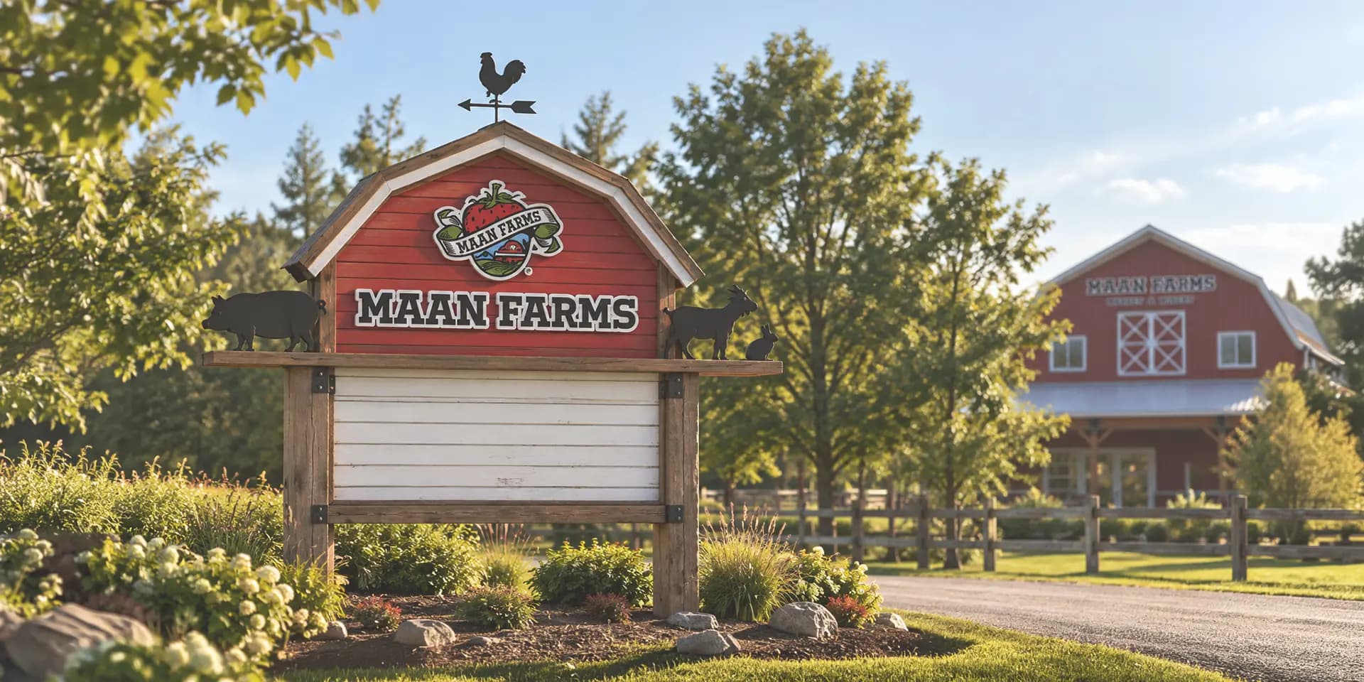
The Maan Farms roadside sign on a timber frame, in front of the farm at golden hour.

Case study · Work

Maan Farms

A 2011 brand identity for an Abbotsford farm and winery.
  • Problem

    Maan Farms had just finished expanding — and the brand it had couldn’t carry the new farm. It needed an identity, not just a website.

  • Solution

    We started at the logo and built the rest out from there.

  • Result

    The farm is still using the identity we made.

Summary

One system rather than a set of separate pieces: the logo, illustration, print, signage, social and the website all read as the same brand — and the farm is still using it.

Services

  • Logo design
  • Illustrations
  • Website design
  • Website development
  • Brochures
  • Newsletter
  • Business card
  • Road signage
  • Store signage
  • Social templates
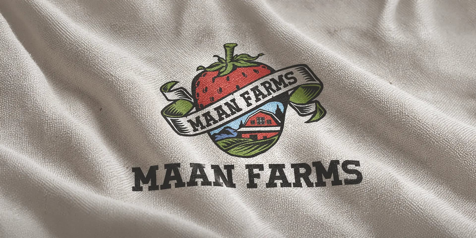
The Maan Farms logo embroidered on fabric: an illustrated strawberry above a banner reading Maan Farms, with a barn and field below, and the bold MAAN FARMS lettering underneath.
Logo design

An illustrated mark — a berry over a banner and a barn — with heavy, bold lettering built to read from a distance.
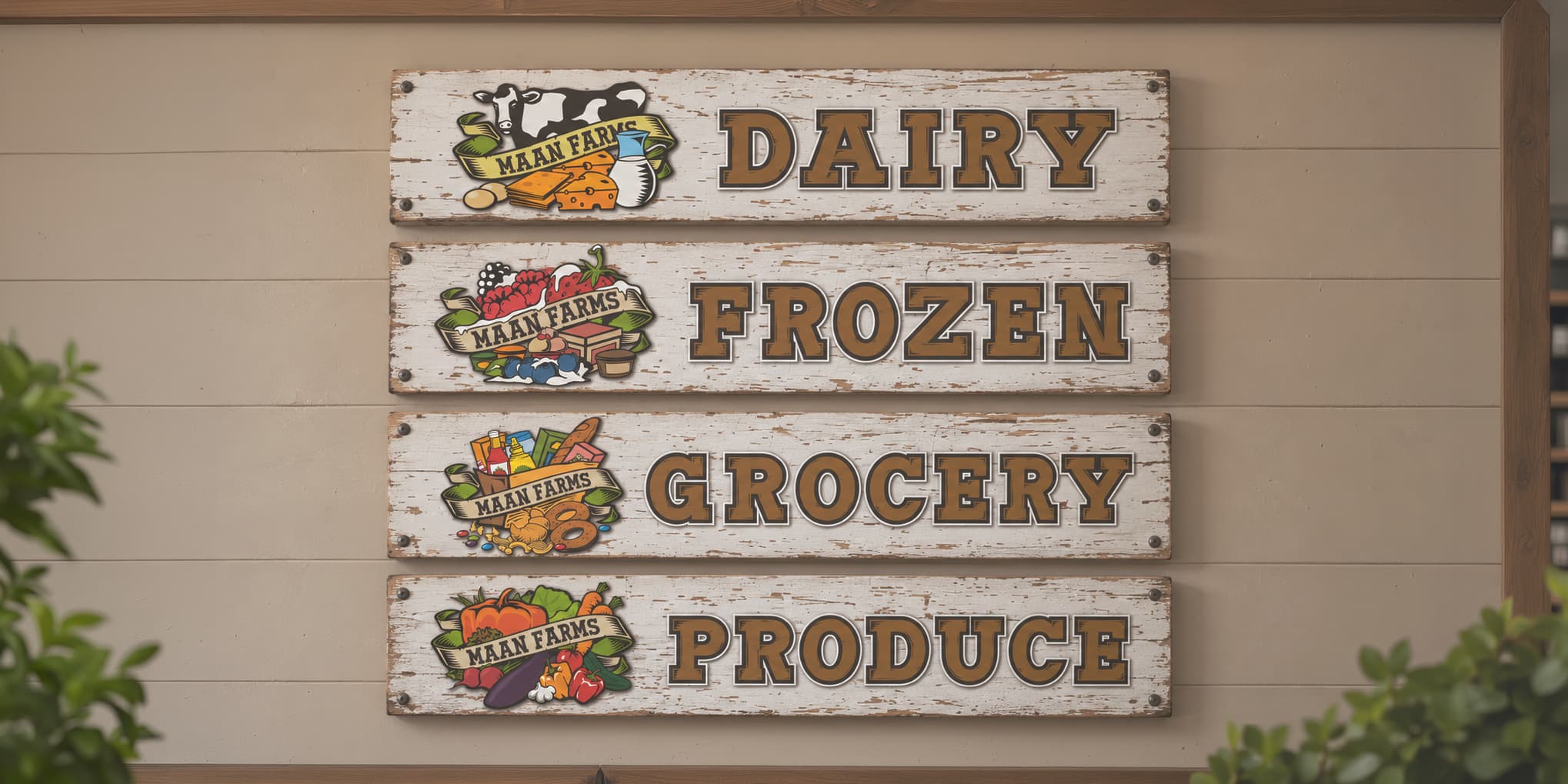
Four illustrated aisle signs for dairy, frozen, grocery and produce, each with its own drawn set of goods beside the cut-out lettering.
Illustrations

Hand-drawn illustration, including the set drawn for the farm’s new barn — used to establish the building as a landmark for Abbotsford’s farm market.
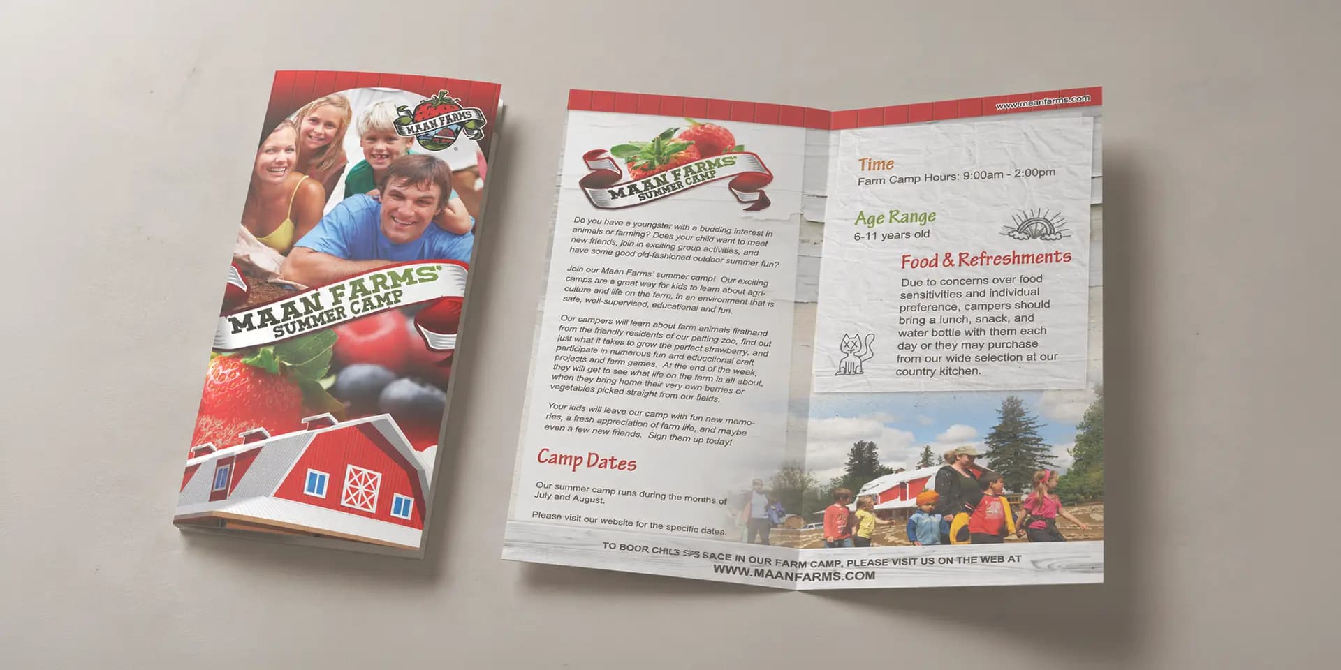
Two copies of the Maan Farms summer camp brochure, open to the inside spread of camp copy, dates and a photo of the fields.
Brochures

Multi-page brochures for the farm’s camps, produce, bakery and winery.
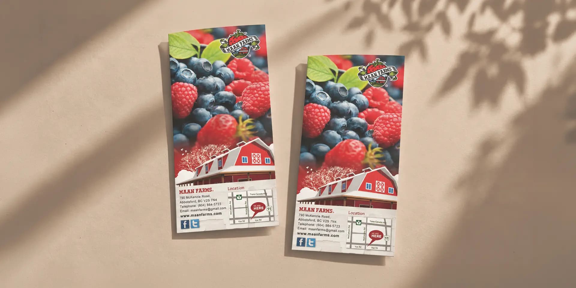
Two Maan Farms berry-season flyers, one face up and one showing the back with the address, map and social links.
Flyers

Handouts for the berry season, front and back, with the farm’s location map printed on the reverse.
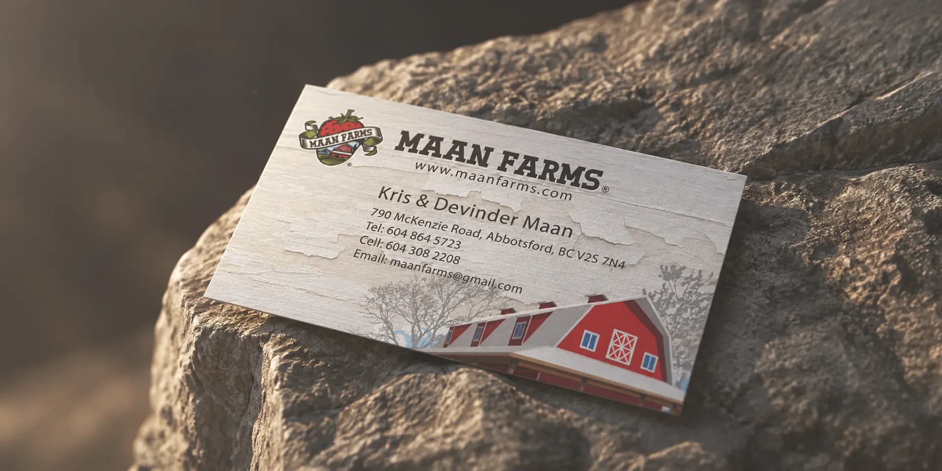
The Maan Farms business card resting on stone: logo and lettering, website, the owners’ names, address, phone, cell and email.
Business card

Cards for the farm, using the same mark and lettering.
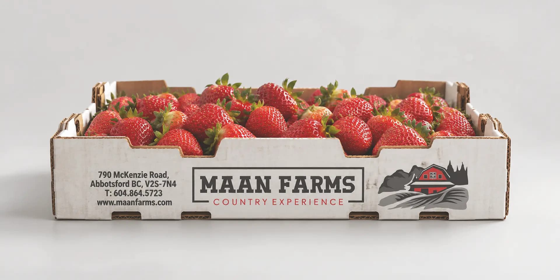
A Maan Farms cardboard strawberry box filled with berries, printed with the lettering, the farm address and the strawberry, blueberry, raspberry and blackberry list.
Packaging

The strawberry box — the mark, the address and the berry list printed straight onto the carton.

The Maan Farms roadside sign: a barn-shaped red board with the logo and lettering, pig, goat and rabbit cut-outs along the frame, and a white reader board below.
Road signage

Signage out at the road, sized to be read on approach.
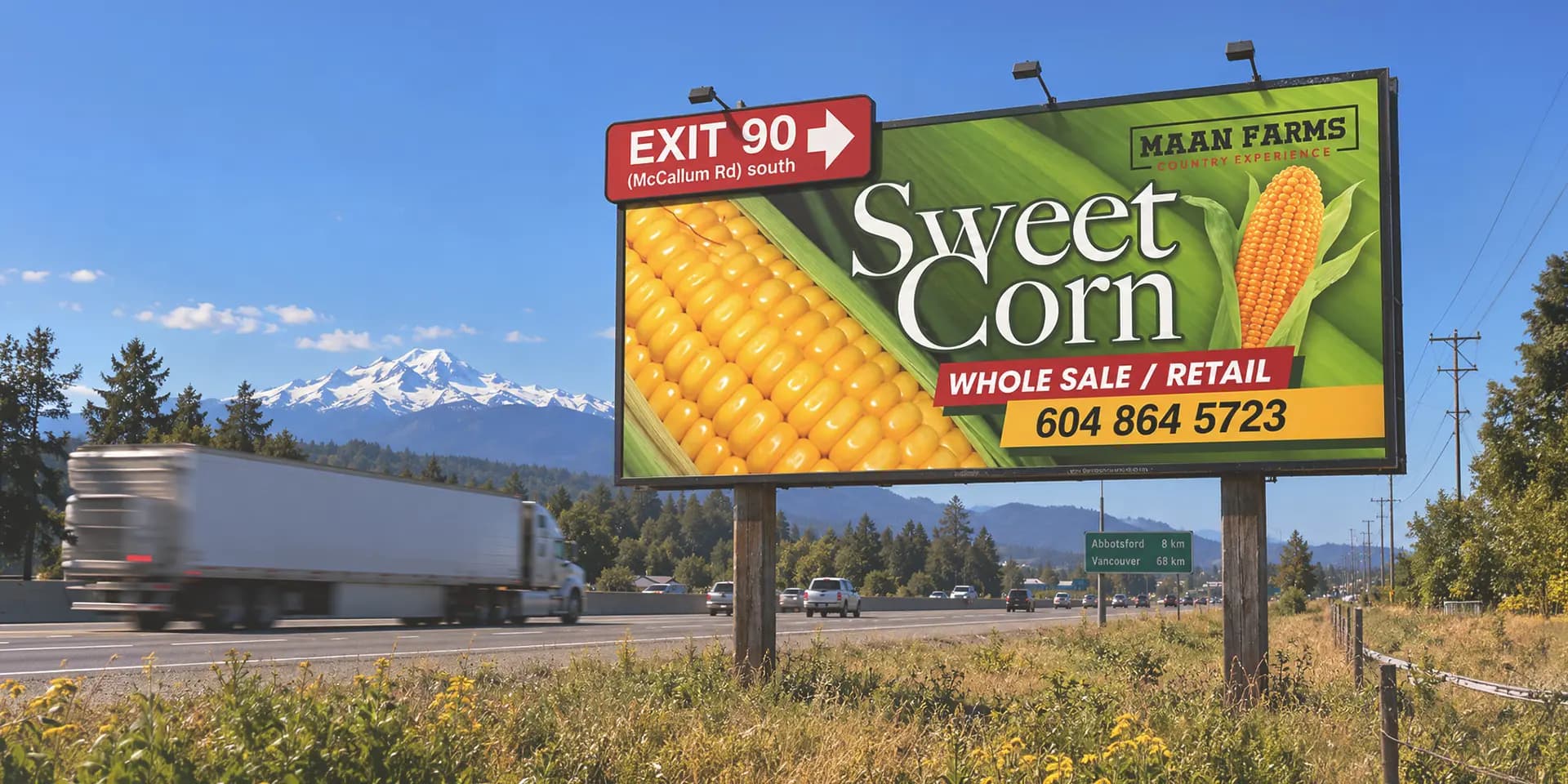
A Maan Farms corn maze billboard beside a highway, with a NEXT EXIT McCallum Rd arrow board and the farm’s logo and website along the bottom.
Highway billboard

A highway board for the corn maze, with the exit direction built into the artwork.
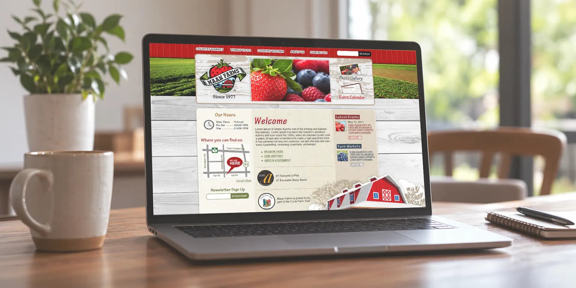
The 2011 Maan Farms website on a laptop: the logo and farm photography in the header, welcome copy, opening hours, a location map and the event calendar.
Website

Layout, photography and illustration for the farm’s site — designed and built, with the newsletter sign-up, event calendar and photo gallery.

Where we work

Langley, Vancouver and across BC.